On November 25, Fed chair Jay Powell gave a speech titled "Building on the Gains from the Long Expansion," in which he observed that
Recent years' data paint a hopeful picture of more people in their prime years in the workforce and wages rising for low- and middle-income workers.
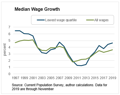
In making this point, Chair Powell used a cut of the Atlanta Fed's Wage Growth Tracker that looks at the median annual wage growth of workers in the lowest 25 percent of the wage distribution. As the following chart shows, the lowest-paid workers have been experiencing higher median wage growth (the blue line) in the last few years than workers overall (the green line). This reverses the pattern seen in the wake of the Great Recession, when median wage growth for lower-paid workers slowed by more than for workers overall.
The faster median wage growth for lower-wage workers shown in chart above has also translated into an increase in the relative median wage level of these workers. To see this, the following chart shows the median wage level for those in the lowest wage quartile relative to the median for all workers in the Wage Growth Tracker dataset.
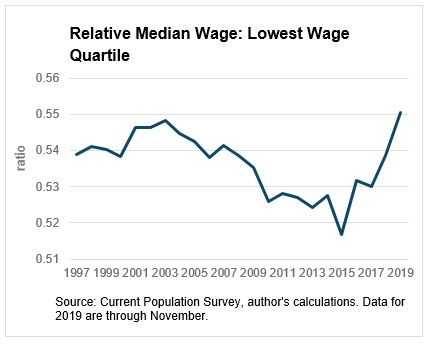
The chart shows that for workers in lower-wage jobs, their relative median wage over the 2000s has deteriorated, and that erosion has reversed course only in the last few years. This reversal may reflect increasing tightness of the labor market for lower-wage jobs relative to other jobs over the last few years. The challenge of filling jobs requiring few skills is something we have been hearing about a lot recently from the businesses we talk to (for example, see here), and this sort of challenge could be behind higher wages for those workers. However, several state and local governments have increased the minimum wage in recent years, which would also push up the relative pay for those in the lowest-paid jobs.
Are the observations in the previous chart solely attributable to minimum wage increases? To get some idea, the next chart contrasts the relative median wage in states that increased their minimum wage at some point between 2014 and 2019 to those that did not. The blue line is the relative median wage of the lowest quartile in the 28 states that increased their minimum wage (23 states introduced new minimum wage levels, and five implemented increases legislated before 2014), and the green line is relative median wage for the states that did not increase their minimum wage.
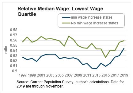
We would expect to see a rise in the relative median wage in the states that raised their minimum wage, and indeed we do. For the group of states that increased minimum wages (the blue line), the relative median wage is now closer to that of states that did not increase their minimum wage (the green line). Interestingly, though, even in the "no increase" states, the relative median wage has improved, suggesting that the increased tightness of labor markets, or some other factor than hikes in state minimum wages, is playing a role in pushing up the pay for those in lower-wage jobs. Consistent with the message of Chair Powell's speech, the good news is that there is scope to continue to build on the gains from the long and ongoing expansion for workers at the bottom end of the wage distribution.
 By John Robertson, a senior policy adviser in the Atlanta Fed's research department