Editor's note: In December, macroblog will become part of the Atlanta Fed's Policy Hub publication.
Measuring progress toward the Federal Open Market Committee's (FOMC) dual mandates of maximum sustainable employment and price stability is often reduced to shorthand: Simply, monitoring the level of the unemployment rate relative to its longer-run trend, and tracking the level of a specific measure of underlying inflation—the so-called "core" measure of personal consumption expenditure (PCE) inflation (which excludes food and energy prices)—relative to the FOMC's 2 percent price stability goal. This ex food and energy "core" measure is often taken as a de facto proxy for the trend in overall (or "headline") inflation. While the unemployment rate and core PCE inflation are, indeed, useful in measuring the FOMC's progress toward its objectives, they are not perfect.
In an influential speech in 2013, Janet Yellen (then chair of the FOMC) argued for a broader, more inclusive approach to monitoring the health of the labor market. The unemployment rate, she pointed out, had significant shortcomings—namely, when unemployed workers became discouraged and stopped looking for work, the unemployment rate would decline. Hence, monitoring a basket or dashboard of indicators (such as payroll employment, data on gross job flows, and quits rates) could help paint a more accurate picture of the health of the labor market.
And, much like former Chair Yellen highlighted the need for a dashboard approach to monitoring the employment mandate, simply using core PCE inflation to track the underlying inflation trend is insufficient. An analogous dashboard approach is needed to monitor progress toward the FOMC's price stability mandate.
For some obvious reasons, movements in the aforementioned core PCE price measure do not always reflect changes in inflation. Explaining why gets a bit academic, but embedded in every price change are, at least, two components. The first is a real component, reflecting changes in the supply and demand for a particular good or service relative to others in the consumers' market basket. The second component is a nominal component, reflecting the supply of money (or the stance of monetary policy) relative to what's needed to facilitate purchases of goods and services in the economy during a given time period. It is that second component—the inflation component—that we are attempting to uncover. Efforts to do this rely on discerning measures of underlying inflation—measures that attempt to remove transitory effects and noise from the price data.
Implicit in using an underlying inflation measure that excludes only food and energy prices is the assumption that every other price change is a reflection of a change in underlying inflation. However, that assumption is off base. Large relative price changes outside of food and energy items, having nothing to do with the FOMC's price stability mandate, often occur. In the abstract, these can be any relative price change, such as a sharp increase in excise taxes, subsidies on prices in particular markets, or temporary supply chain disruptions resulting from natural disasters, pandemics, or a disruption in global trade.
Specifically, over the past six years or so, we've seen at least three of these large and salient relative price changes that have materially affected core PCE inflation. The first example is changes in administered health care prices that lead to a sharp slowing in the price index for hospital services (and thus health care prices in general) shortly after the passage of the Affordable Care Act (often referred to as Obamacare). The second is a methodological change that the U.S. Bureau of Labor Statistics enacted in January 2017, which made cell phone service prices more sensitive to quality changes. In March 2017, a few large national carriers switched to offering largely unlimited data packages, yielding a 50 percent (annualized) decline in this component and having a striking impact on year-over-year core PCE inflation through March 2018. The third is a series of huge price swings in imputed financial services prices in late 2018 and early 2019.
These are just a few of the most salient relative price changes that have altered a "core PCE-centric" view of inflation over the prior expansion, but there have been many more. Thankfully—and in large part due to great work throughout the Fed system to understand and measure inflation—we have a variety of alternative inflation measures designed to limit the influence of these large, idiosyncratic price changes. A few of the better-known ones are the Cleveland Fed's median and 16 percent trimmed-mean CPI and the Dallas Fed's trimmed-mean PCE measure. These measures remove the influence of sharp component price swings on a monthly basis and, as a result, tend to have a lower variance than the usual "core" measures, leading to superior forecasting performance over most time horizons and in a variety of inflation forecasting models.
Another set of inflation indicators reweights, or classifies, detailed components in the consumers' market basket into different groups based on characteristics that a monetary authority (such as the Federal Reserve) should be interested in. First, let's consider indicators such as the San Francisco Fed's Cyclical Core PCE Inflation index and Stock and Watson's Cyclically Sensitive Inflation Index. These measures either exclude or deemphasize the weight of prices that do not move in tandem with the business cycle. The argument goes that certain components of the consumer's market basket (such as health care and education prices) follow strong, idiosyncratic trends, and therefore price changes among these components are more likely to reflect relative price changes rather than the influence of monetary policy working through the pricing mechanism.
A third type of inflation indicator is the Atlanta Fed's Sticky Price CPI. This measure tracks a set of CPI components that are slow to react to changing economic conditions (and hence are "stickier" than other components) and appear to incorporate expectations about future inflation to a greater degree than prices that change on a frequent basis. This measure tends to forecast inflation over longer time horizons more accurately than headline or core inflation measures.
We have pulled together these various measures into the Underlying Inflation Dashboard, which allows users to see a more complete picture of underlying inflation. A quick overview of this dashboard is in order (see chart 1). The first section of the table shows the 12-month growth rate of each underlying inflation measure. It compares the most current data to the value of a measure from one year prior. Each measure is color-coded, in 25 basis point (bp) increments, relative to its price stability target. Admittedly, the choice for each measure's price stability target is somewhat arbitrary, but given the primacy of core PCE inflation in the communications of the FOMC and the Federal Reserve, we chose to express each measure's target as 2 percent plus its average difference with core PCE inflation over the past decade. For example, the growth rate in the core CPI over the past 10 years is 30 bp higher than that of the core PCE, yielding a price stability target of 2.3 percent.
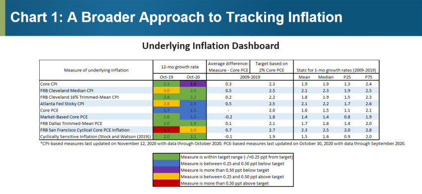
What's interesting to see is the narrative that emerges by taking the dashboard approach to monitoring underlying inflation.
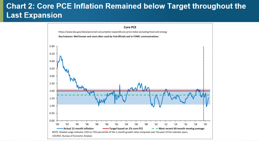
Prior to the onset of COVID-19 earlier this year, the consensus view surrounding inflation was one of persistent shortfall, even after (at least) achieving maximum employment by most measures. Indeed, at least through the beginning of 2020, core PCE inflation continued to trend below target (see chart 2).
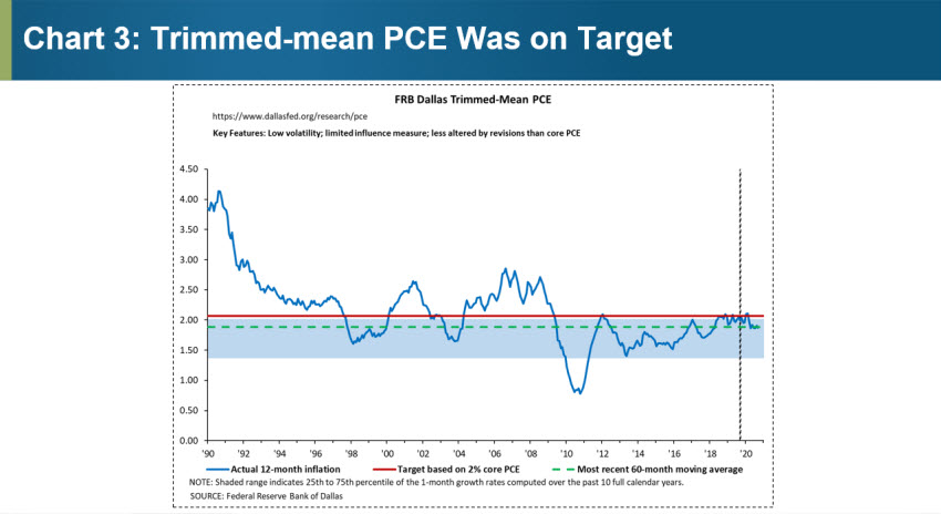
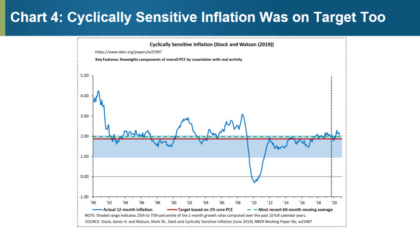
However, every other measure of underlying inflation in the dashboard had converged to a growth rate consistent with the Fed's price stability mandate by early in 2018 and stayed there up until the onset of the pandemic (see charts 1, 3, and 4). Taking a dashboard approach leads us to the conclusion that, while it took some time following the Great Recession, inflation had converged to our price stability target and remained on target until March 2020.
The previous discussion made the case for using a dashboard approach when evaluating underlying inflation prior to the onset of the COVID-19 pandemic. Since then, a series of dramatic relative price swings, along with direct complications in the physical measurement of prices, have further complicated the measurement of underlying inflation.
One particularly salient example comes from used auto prices. Auto prices have surged, rising at a record annualized rate of 75 percent from July to September. This spike is likely the result of a combination of increased demand stemming from commuters attempting to avoid mass-transit options, less confidence over future incomes, and a temporarily reduced supply of new vehicles. This relative price change alone has pushed the 12-month growth rate in core PCE goods prices up by nearly a full percentage point and added nearly three tenths of a percent to the 12-month trend in core PCE inflation. In contrast, trimmed-mean estimators (such as the Cleveland Fed's 16 percent trimmed-mean CPI and the Dallas Fed's trimmed-mean PCE) have largely ignored (hence the "trimmed") the influence of this rather dramatic price swing over the prior three months—leading to much more stable month-to-month estimates of underlying inflation.
It is precisely these types of dramatic relative price swings that argue for the broader approach we've sought to provide with the Underlying Inflation Dashboard. We hope you'll give it a whirl and let us know what you think.
 Brent Meyer, policy adviser and economist in the Atlanta Fed's Research Department, and
 Emil Mihaylov, research analyst in the Atlanta Fed's Research Department