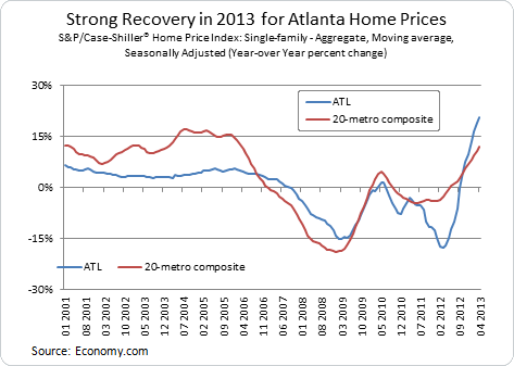
As with politics, all real estate is local, and it seems that it is always someone else's neighborhood that's doing well. By all indications, housing is recovering in 2013. Nationally, starts and prices show promising growth. Even in Atlanta, Georgia—a hotbed of subprime lending and speculative construction before the crash—home prices have made a strong rebound, showing a 21 percent year-over-year increase in April 2013 (see the chart). In this post, we address the questions: What shape is this recovery taking? Will this rebound look a lot like the early 2000s? Or can we expect permanent changes to the urban landscape post-crisis?

Using zip code-level data from CoreLogic to take a closer look at home price recovery in Atlanta, we see that this rebound is not evenly distributed. Instead, variation in growth rates is much higher than it used to be. In general, Atlanta home prices have been very depressed, but at the same time, contacts have remarked that in hot, single-family markets, prices are up, multiple offers are made as soon as a property is listed, and there is a general shortage of homes "where people want to move." The data confirms and adds to this anecdotal evidence: Atlanta's strong price growth is concentrated in select intown markets, as well as in many of the areas hardest hit.

Prior to the crisis, home prices appreciated at about the same rate throughout the Atlanta metropolitan region. Yes, some areas were expensive and others affordable, but prices grew everywhere at roughly the same pace. But when the real estate market crashed in 2007, Atlanta home price rates of change began to diverge. In the past, zip codes with the highest growth rates grew 20 percent faster than zip codes with the lowest rates. Now, that ratio has risen to 300 percent.
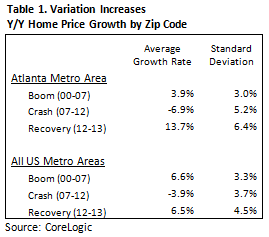
To illustrate, the standard deviation in home price growth increased sharply during the crisis and continued to widen during the last year of recovery (see table 1). This pattern also describes the nationwide trend, although the increases in variation in Atlanta are more dramatic.
The obvious explanation for this is that during the crash, although prices fell everywhere, areas with concentrations of distressed properties fell more steeply, generating this variation. Now that the recovery is under way, though, will areas with a high density of distressed properties rebound? Or are these areas reset permanently at a lower level?
The evidence from Atlanta suggests that we will see a bit of both. Fast growth is concentrated in some of the areas that were hardest hit, as well as in some of the choicest neighborhoods in town. This extremely fast growth is paired with slow growth in many markets that never saw steep declines, generating a higher standard deviation in home prices.
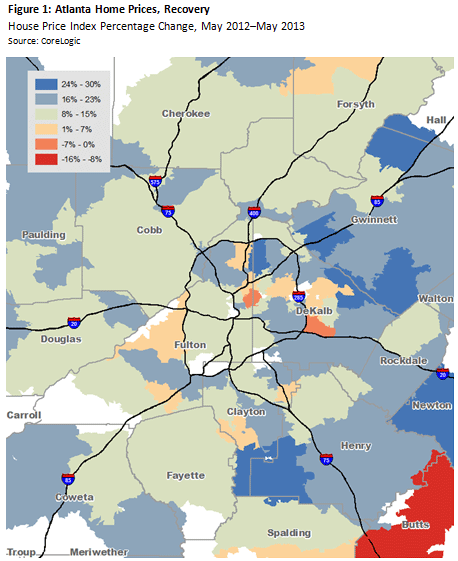
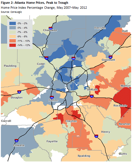
The first map below shows year-over-year home price change during the recovery. The second map depicts peak and trough change, showing the depth of the decline. We see that two recovery stories emerge. First, north of I-20, areas that were quite resilient during the crisis and did not see strong declines are experiencing strong growth. Second, in the areas southeast of the interstate 285 perimeter, we see exurbs that were devastated by devaluation experiencing a strong rebound, with growth rates over 16 percent.


How can we best understand this pattern of recovery? We reviewed a few likely correlates with home price increase: household income, household size, and density of high-risk lending and speculative construction during the bubble. None of these factors was significantly correlated with the 2013 rebound. The peak-to-trough change is significantly correlated with the rate of recovery, suggesting that much of this recovery is a price correction. Longer commute times are also correlated with recovery, revealing that demand is increasing in places that are not close to job centers, though it's possible that commute times are simply a proxy for severity of the crash as these areas also experienced the strongest declines.
Contacts tell us that neighborhoods with better school districts are performing well and recent investor interest may also be playing a role. What is certain is that Atlanta's strong overall house price growth is driven by increases in areas hardest hit by the housing downturn and by a few centrally located markets, and that underneath the citywide average there is a lot more variation than we have experienced in the past.
We'd love to hear your thoughts about these trends!
By Elora Raymond, graduate research assistant, Center for Real Estate Analytics in the Atlanta Fed's research department/PhD student, School of City and Regional Planning, Georgia Institute of Technology, and
Carl Hudson, Director, Center for Real Estate Analytics in the Atlanta Fed's research department


