Measures of year-over-year growth in wages (or hourly earnings) used in economic analysis often tell a fairly consistent story. For example, chart 1 makes it apparent that wage growth was generally higher heading into the 2007–09 recession than heading out of it and that wage growth stayed low for the first half of the 2010s before trending up moderately over the second half of the decade. However, with the onset of the COVID-19 pandemic, growth in average hourly earnings from the US Bureau of Labor Statistics' (BLS) establishment survey (the blue line in the chart) deviated substantially from the other two series depicted.
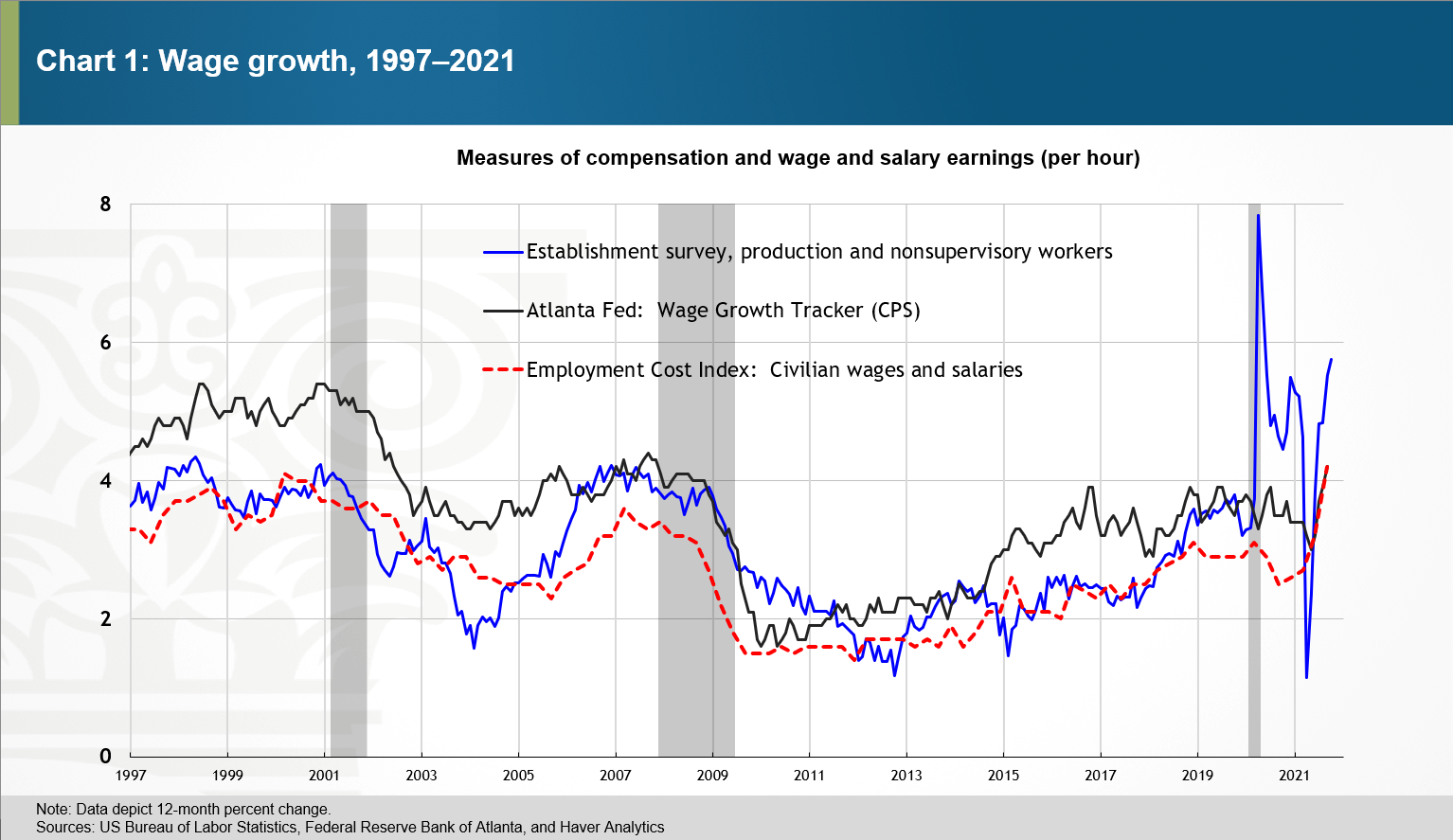
The leisure and hospitality industry provides a useful illustration of why the establishment survey measure of hourly earnings growth spiked in March and April of last year. In February 2020, average hourly earnings for production and nonsupervisory workers![]() in leisure and hospitality were 40 percent lower than they were for all private nonfarm payroll workers. And although the leisure and hospitality industry accounted for just under 14 percent of private nonfarm production and nonsupervisory jobs in February 2020, it accounted for nearly 40 percent of the lost private production and nonsupervisory jobs in the subsequent two months. The 4.5 percentage point increase from February 2020 to April 2020 in the blue line in chart 1 falls by 1.9 percentage points if we remove leisure and hospitality from the calculation.
in leisure and hospitality were 40 percent lower than they were for all private nonfarm payroll workers. And although the leisure and hospitality industry accounted for just under 14 percent of private nonfarm production and nonsupervisory jobs in February 2020, it accounted for nearly 40 percent of the lost private production and nonsupervisory jobs in the subsequent two months. The 4.5 percentage point increase from February 2020 to April 2020 in the blue line in chart 1 falls by 1.9 percentage points if we remove leisure and hospitality from the calculation.
The August 2020 FRBSF Economic Letter—aptly titled "The Illusion of Wage Growth"—by Erin E. Crust, Mary C. Daly, and Bart Hobijn shows that restricting the sample to people employed in the second quarters of 2019 and 2020 reduced growth in median usual weekly earnings over that period by nearly 8 percentage points from the published rate of 10.4 percent. The Atlanta Fed's Wage Growth Tracker, which uses the same type of restriction, and the Employment Cost Index (ECI), which controls for employment share changes among industries and occupations![]() , were not subject to the illusion of wage growth shown by the blue line in chart 1.
, were not subject to the illusion of wage growth shown by the blue line in chart 1.
Unfortunately, the adjustments used in the Wage Growth Tracker and the ECI are not feasible with the establishment survey measure of hourly earnings because that measure is constructed solely from the information in each month's employment report. As an alternative, Goldman Sachs provides an adjustment![]() for what it terms the composition bias in the establishment survey measure. This adjustment keeps hours worked fixed at their year-ago level in the wage calculation using industry-level data.
for what it terms the composition bias in the establishment survey measure. This adjustment keeps hours worked fixed at their year-ago level in the wage calculation using industry-level data.
I've written an appendix ![]() that provides the details of a related approach for calculating a composition-adjustment term from the monthly establishment survey data. Besides adjusting for industry composition, this approach also adjusts for types of workers: production and nonsupervisory workers versus nonproduction/supervisory employees. The appendix also shows that adjusting for worker type and industry rather than industry alone materially affects the composition-adjusted measure of average hourly earnings for April 2020. It also shows that—unlike measures from the BLS
that provides the details of a related approach for calculating a composition-adjustment term from the monthly establishment survey data. Besides adjusting for industry composition, this approach also adjusts for types of workers: production and nonsupervisory workers versus nonproduction/supervisory employees. The appendix also shows that adjusting for worker type and industry rather than industry alone materially affects the composition-adjusted measure of average hourly earnings for April 2020. It also shows that—unlike measures from the BLS![]() and the San Francisco Fed
and the San Francisco Fed![]() , which control for educational attainment—the measure of labor composition (sometimes called labor quality
, which control for educational attainment—the measure of labor composition (sometimes called labor quality ![]() ) constructed with only establishment survey data has not trended up much since the mid-2000s.
) constructed with only establishment survey data has not trended up much since the mid-2000s.
The basic intuition underlying the approach described in the appendix is that, apart from some trivial rounding error, the BLS measure of aggregate weekly payrolls![]() is equal to the product of average hourly earnings and aggregate weekly hours worked. So, in much the same way that we can express nominal gross domestic product (GDP) as the product of real chain-weighted GDP and a GDP price deflator, aggregate weekly payrolls can also be decomposed as the product of composition-adjusted measures of wages and hours worked. This approach maintains the equality with aggregate payrolls since the composition adjustments to hourly earnings and hours worked offset each other exactly.
is equal to the product of average hourly earnings and aggregate weekly hours worked. So, in much the same way that we can express nominal gross domestic product (GDP) as the product of real chain-weighted GDP and a GDP price deflator, aggregate weekly payrolls can also be decomposed as the product of composition-adjusted measures of wages and hours worked. This approach maintains the equality with aggregate payrolls since the composition adjustments to hourly earnings and hours worked offset each other exactly.
Chart 2 shows the results of adjusting for changes in both industry and worker type for measures of average hourly earnings growth and aggregate hours worked during the pandemic. Adjusting for composition makes average hourly earnings growth during the pandemic more like the ECI and Wage Growth Tracker measures, but, nevertheless, some important differences exist. Unlike the composition-adjusted measure of nominal wage growth, the ECI and Wage Growth Tracker measures languished in the second half of 2020 and surged in their most recent readings. Composition-adjusted hourly earnings grew 1.1 percent from March 2020 to April 2020, which is less than the 4.6 percent spike in the unadjusted measure but still strong enough to suggest that the adjustments made here still miss some meaningful changes in worker composition in the earliest months of the pandemic.
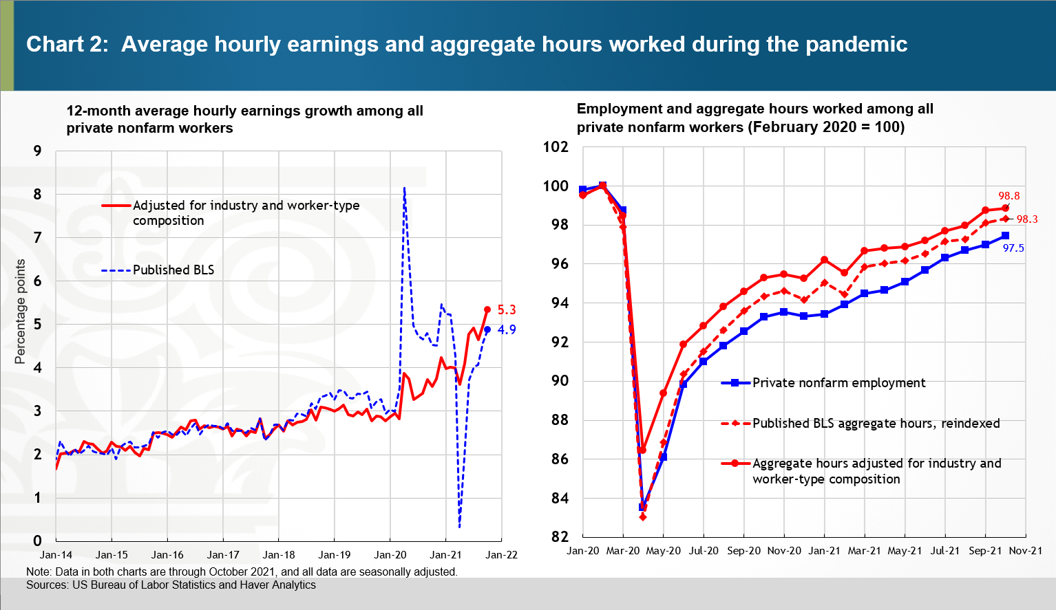
As you look at this chart, note that the adjustment is constructed using wage and hours data for 253 industry groups, all but 10 of which are further split into production and nonsupervisory and nonproduction/supervisory employee groups.
The right panel in chart 2 shows private nonfarm payroll employment alongside the standard measures of aggregate hours worked and a measure adjusted for industry and worker-type composition. In October, private nonfarm payroll employment, hours worked, and composition-adjusted hours worked were 2.5, 1.7, and 1.2 percentage points, respectively, below their February 2020 levels.
The composition-adjustment factor (industry by production/supervisory worker employment type) as well as the associated measures of composition-adjusted hours worked and hourly earnings are available here ![]() . Future updates of this Excel file will also be available at this link.
. Future updates of this Excel file will also be available at this link.
By  Pat Higgins, a policy adviser and economist in the Atlanta Fed's Research Department