A meeting of the Federal Open Market Committee. Photo courtesy of the Federal Reserve Board of Governors
They look innocent enough: 17 little blue circles on a computer screen.
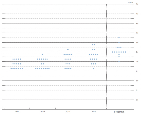
But these aren't just any dots. The blue circles represent the Federal Open Market Committee (FOMC) members' assessments of the appropriate path of monetary policy for the current year, each of the next three years, and then for the longer run—five or six years.

From September, the Federal Open Market Committee's most recent dot plot.
The "dot plot" can cause a big stir. It is actually one of four parts of the summary of economic projections of FOMC members. The other three are projections for gross domestic product (GDP) growth, the unemployment rate, and inflation. The FOMC began publishing the projections twice a year in 1979, and then four times a year alongside other immediate postmeeting materials in October 2007.
The graphical dot plot made its debut in January 2012 and quickly became a sensation in certain corners of the financial markets. Some investors, traders, and commentators came to view the dots as a straightforward prediction of the future path of the FOMC's main policy interest rate, the federal funds rate.
That predictive quality, however, was never the FOMC's intent. From the start, the projections were meant to increase transparency about the range of views within the FOMC. This transparency, in turn, should enhance the efficacy of monetary policy.
Dot plot is not a consensus forecast
The collection of little circles is not a consensus forecast of the committee. Instead, the dots represent each FOMC member's individual assessment of the appropriate future level of the federal funds rate. All FOMC participants—the presidents of the 12 regional Reserve Banks, along with each Fed governor—get a dot, even those who are not currently voting at the committee meetings.
"It's not a decision-making document, and it shouldn't be viewed as such," said Atlanta Fed president Raphael Bostic. "We don't have debates among committee members about the dots. In fact, we don't have any discussion at all."
Rather than a road map of future monetary policy, Bostic suggests a better way to view the dots is as a "nowcast." Basically, the dot plot amounts to 17 snapshots illustrating at a particular moment in time how each committee member figures policy should play out over the short and long run.
In this way, the dot plot demonstrates the diversity of views on the committee and underscores that votes on policy are not preordained. Indeed, the dots are typically scattered. The projections, including the dot plot, are distinct from the collective outlook of the FOMC that is summarized in the committee's statements. The statements and other materials include a far more nuanced and comprehensive picture of what considerations FOMC members are weighing as they strive to calibrate monetary policy to achieve the Fed's dual mandate of maximum employment and stable inflation.
Continuing progress on transparency
Over the years, the summary of economic projections has expanded to include not only the dot plot, but also medium- and longer-term forecasts of GDP growth, the unemployment rate, inflation, and the federal funds rate.
"Because monetary policy affects spending and inflation with a lag, policy decisions must be based on an assessment of medium-term economic prospects," then Fed chair Ben Bernanke said when he announced the more frequent release of the projections. "Thus, the Committee cannot fully explain its policy decisions without sharing its economic outlook with the public and the Congress."
The introduction of the dot plot marked another step in the Fed's efforts to make its work more visible to the public. Other notable milestones include:
- In 1983, the first publication of the Beige Book, which summarizes information from business contacts about economic conditions
- In 1994, the first release of a postmeeting statement after the FOMC took policy actions
- In 2000, the first release of the regular postmeeting statement
- In 2005, the earlier release of meeting meetings, a change from a delay of six or seven weeks to three weeks
- In 2011, the introduction of quarterly news conferences
- In 2019, news conferences after every FOMC meeting.
There are typically eight FOMC meetings a year.
Plots show lowered expectations for long-term growth
One big takeaway from a look over time at the economic projections: like many forecasters, FOMC members have lowered their expectations for the economy's long-term growth potential. At the end of 2012, members' median longer-run GDP growth projection was 2.4 percent. The most recent figure, from September's summary of economic projections, was 1.9 percent.
So in a broad context, the summaries illustrate the complex nature of forecasting the direction of the economy and formulating monetary policy.
In a 2011 speech, then Atlanta Fed president Dennis Lockhart noted that reacting to surprises is simply part of a policymaker's job. "Conveying a false precision does not increase confidence about economic outcomes, and it ultimately damages future credibility," Lockhart said.
It appears that some observers may attach a "false precision" to the dot plot, reading into it a certitude that FOMC members never intended. But it's likely that the collection of dots will continue to garner outsize attention.


