One of the most popular features of the Atlanta Fed's Wage Growth Tracker is its depiction of median year-over-year wage growth of four different wage levels (wage quartiles). Unfortunately, the sample size of each quartile for a month is quite small, and thus the median wage growth for each quartile is noisy. For that reason, the Tracker shows changes by wage quartile only as a 12-month moving average. However, although the averaging smooths out a lot of the month-to-month noise in the series, it also means that the series have a substantial lag in showing wage growth changes across quartiles.
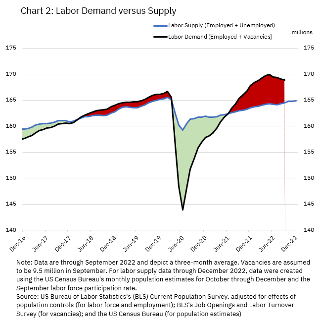
Instead, I have produced a cut of the wage growth data by wage level that can show a three-month moving average, which gives a better near-term picture of wage growth trends. The restriction, however, is that rather than using four wage groups, I put the average wage-level data (that is, the average of a person's reported wage in the current month and their reported wage a year earlier) into two groups: those whose average wage is above the median and those whose average wage is below the median. Essentially, I split the distribution of average wages in half.
Chart 1 plots the resulting three-month moving average of the two groups' median wage growth.
As you can see, median wage growth has been elevated since 2020 for workers across the wage distribution. But for workers in the bottom half of the wage distribution, median growth has been especially high during the last year. High wage growth for lower-paid workers aligns with numerous anecdotal reports suggesting that worker shortages since the pandemic have been especially acute in industries that pay below-average wages, such as leisure and hospitality.
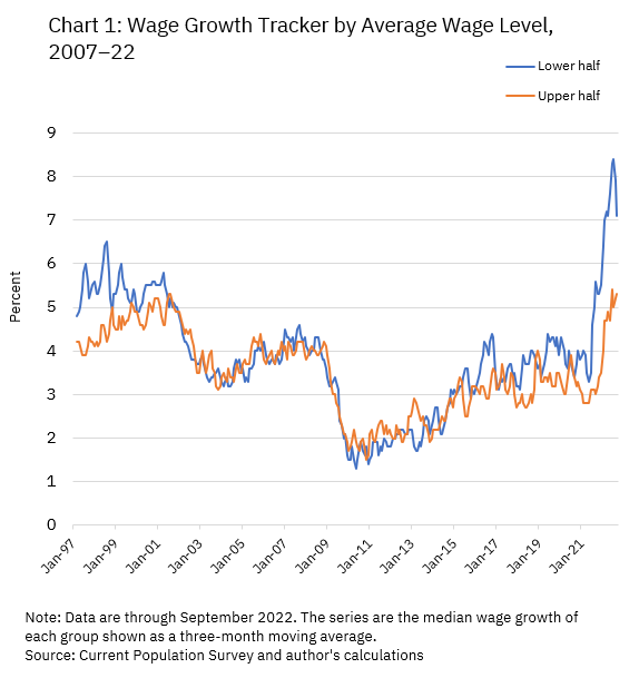
Chart 1 allows another interesting observation: in the years leading up to the pandemic, the median wage growth of those in the lower half of the wage distribution was typically a bit above those in the upper part of the distribution. This was a period when the labor market was also tight, although much less so than it is today. Chart 2, which shows the sum of employment and job openings relative to the size of the available labor force, makes clear the divergence in the degree of overall labor market tightness today versus prior to the pandemic.
By this measure, though the gap has narrowed a bit in recent months, labor demand remains well above its supply, and this gap has been putting upward pressure on wages across the spectrum.
The Wage Growth Tracker series for the two wage groups is available now in the downloadable spreadsheet here and will be updated with October data after the Current Population Survey micro data for October is released, which usually occurs about a week after the US Bureau of Labor Statistics issues its labor report.

By John Robertson, a senior policy adviser in the Atlanta Fed's Research Department