I started using the Atlanta Fed's Wage Growth Tracker for economic analysis about 10 years ago. Since I'm about to retire after 26 years at the Atlanta Fed, now seems like a good time to look back at the history of the Tracker, and it's also an opportunity to remind users of what it is and, perhaps more importantly, what it is not.
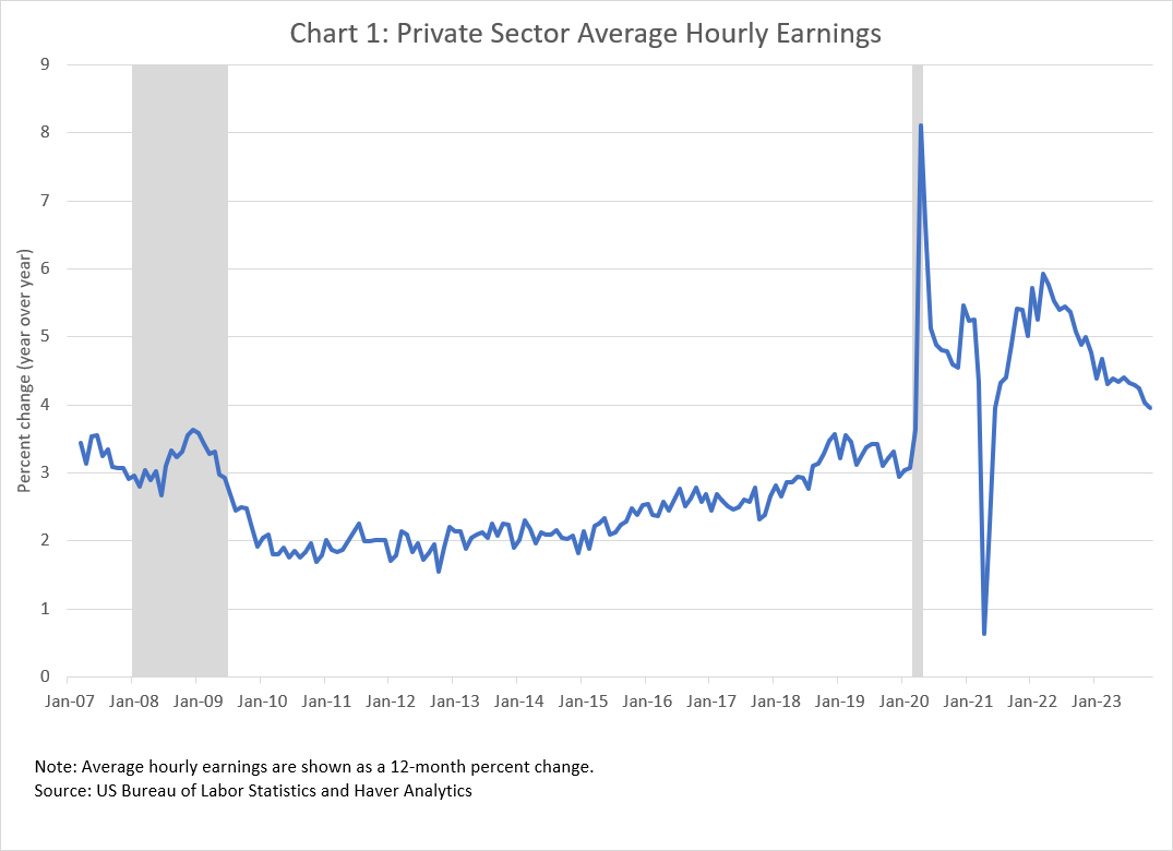
The origin story has three parts. The first is the simple observation that firms do not lay off (or hire) workers randomly. For example, facing sharply lower demand for their goods and services during the Great Recession of 2008–09, many firms reduced their staffing levels. However, these layoffs tended to be concentrated among relatively lower-paying jobs. Although this had the effect of reducing the firm's total wage bill, it also mechanically caused the average wage per job to rise. Somewhat counterintuitively, this meant that measures of aggregate wage growth such as the change in average (per job) hourly earnings from the US Bureau of Labor Statistics's payroll survey![]() rose at a time when labor demand was very weak. Chart 1 shows this "composition effect," where you can see the year-over-year growth in private-sector average hourly earnings from the payroll survey. You can also see that the composition effect is even more dramatic during the lockdown period of the COVID-19 pandemic in 2020.
rose at a time when labor demand was very weak. Chart 1 shows this "composition effect," where you can see the year-over-year growth in private-sector average hourly earnings from the payroll survey. You can also see that the composition effect is even more dramatic during the lockdown period of the COVID-19 pandemic in 2020.
The rise in average wages during the Great Recession led to different ways to look at the cyclicality of wage growth that are not affected by changes in the composition of employment—and this leads to the second part of the origin story. At the same time, Fed colleagues Mary Daly![]() (president of the San Francisco Fed) and Bart Hobijn
(president of the San Francisco Fed) and Bart Hobijn![]() (a senior economist at the Chicago Fed) were using the short panel structure of the Current Population Survey
(a senior economist at the Chicago Fed) were using the short panel structure of the Current Population Survey![]() (CPS) to study the fact that during economic downturns firms were more likely to freeze workers' wages than to cut their wages, even though workers were in a weak bargaining position (see here
(CPS) to study the fact that during economic downturns firms were more likely to freeze workers' wages than to cut their wages, even though workers were in a weak bargaining position (see here![]() , for example). What they did was match up the reported wage of the sample of workers in the outgoing rotation of the CPS to what was reported for those same workers a year earlier, and then they computed the fraction of individual wage changes that were zero. They found a countercyclical pattern of wage rigidity; that is, wage freezes are more likely when labor demand is weak.
, for example). What they did was match up the reported wage of the sample of workers in the outgoing rotation of the CPS to what was reported for those same workers a year earlier, and then they computed the fraction of individual wage changes that were zero. They found a countercyclical pattern of wage rigidity; that is, wage freezes are more likely when labor demand is weak.
Their observation got us thinking about the cyclical behavior of the "typical" wage growth experience of workers and whether there would differences across types of workers, such as those who changed jobs versus those who didn't, or younger versus older workers, or those in relatively low- versus higher-wage jobs. This question leads to the third part of the Tracker's origin story. My computer programing skills, like my typing skills, are very much of the "hunt and peck" variety. Fortunately, I had a talented and enthusiastic colleague, Ellie Terry![]() , who did a lot of the heavy lifting involved in coding the Wage Growth Tracker and constructing various cuts of the data. She was also instrumental in developing a version of the entire CPS dataset that linked people over time (within the panel structure of the CPS) and had consistent variable names and definitions. Ever since, I have regularly used this dataset for my day-to-day analysis of CPS data.
, who did a lot of the heavy lifting involved in coding the Wage Growth Tracker and constructing various cuts of the data. She was also instrumental in developing a version of the entire CPS dataset that linked people over time (within the panel structure of the CPS) and had consistent variable names and definitions. Ever since, I have regularly used this dataset for my day-to-day analysis of CPS data.
Because the cross-sectional distribution of wage growth in that CPS dataset is wide and skewed, we decided to use the median as a statistically robust measure of "typical." However, users should keep in mind that, for a variety of reasons, the sample used to estimate the median is relatively small. First, the survey asks earning questions of only about a quarter of the people in CPS panel each month. Second, a lot of people don't provide their earnings information, so the Census Bureau imputes their missing data. We decided to exclude imputed wages because we found that they added considerable noise to the estimates. Third, we exclude wages that are top-coded, or censored, as that top-coding would show up as zero wage change. Between 2003 and 2022, the annualized wage top-code maximum used by the Census Bureau was $150,000. At the other extreme, we exclude observations if the hourly wage is implausibly low (less than federal minimum for tip-based jobs of $2.13 an hour). This left between 1,500 and 2,000 wage growth observations each month. Given the relatively small sample of wage growth observations, it was clear that the data could not be sliced very finely. For example, it would not make sense to show a Wage Growth Tracker time series at a state level. In addition, some smoothing of the time series of median estimates was necessary. Several series are shown as a three-month moving average, while cuts of the data with more disaggregated groupings are only shown as 12-month moving averages.
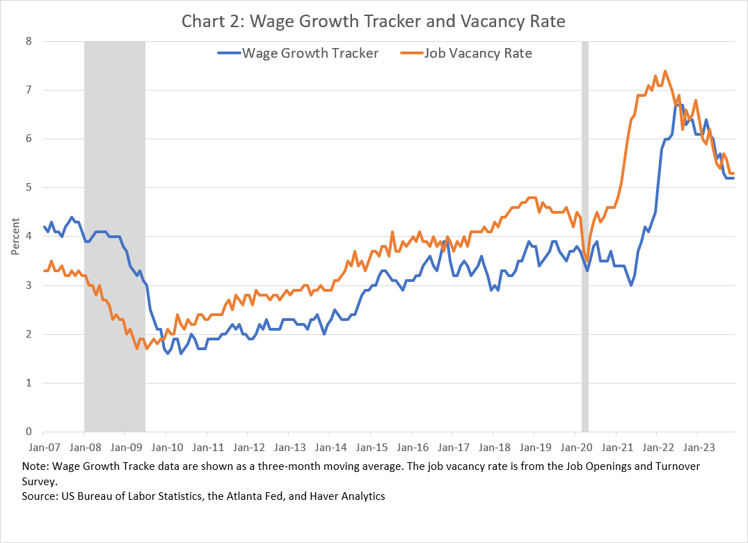
The combination of smoothing and the fact that we are looking at the year-over-year change in wages means that the Tracker is a somewhat lagging indicator of changes in labor market tightness. You can see this in chart 2, which shows the three-month average version of the overall Wage Growth Tracker plotted along with a measure of the job vacancy rate from the BLS's Job Openings and Labor Turnover Survey![]() . The big swings in the vacancy rate data start several months before the swings in the Tracker data.
. The big swings in the vacancy rate data start several months before the swings in the Tracker data.
To recap, the Wage Growth Tracker is a time-series of the "typical" wage growth experience of the sample of workers who are employed in the current month and a year earlier. Consequently, the Tracker is not a measure of the typical wage growth experience of the population of everyone employed in a given month because some of the people working were not employed a year ago (their wage growth would be infinitely large), and vice versa. Because intermittent employment is more common among younger and less educated populations, the Wage Growth Tracker sample is older and more educated than the overall employed population. However, we do have one version of the Tracker that is weighted to be more representative of the employed population in each month—essentially by giving more weight to younger and less educated workers. Another version makes the Tracker data more representative of the employed population in 1997. We created the 1997 version because, even though the median wage growth for each month is constructed by comparing the wages of the same people, the demographic composition of the working population has changed over time. Specifically, it is older and more educated on average than in 1997.
It's also important to keep in mind that the wage data in the CPS have several limitations, including that it is self-reported (in fact, the survey respondent is reporting wage information for everyone in the household), top-coded (censored), and now rounded. The sample size of the CPS has also declined significantly in the wake of the COVID-19 pandemic, as has the willingness of people to report wage information.
Despite its various limitations, the Wage Growth Tracker has proved to be a useful and popular economic indicator. The distinction between the wage growth experience of those changing jobs has been especially important in the recent tight labor market, as was the rapid rise in the wage growth of those in the lower part of the earnings distribution. The popularity of the Tracker has also contributed to the development of other ways to look at wage growth. For example, the job site Indeed![]() has created a wage growth measure using the Tracker methodology but applied to matched job posting data, while the ADP Research Institute
has created a wage growth measure using the Tracker methodology but applied to matched job posting data, while the ADP Research Institute![]() has applied the Tracker methodology to matched payroll transactions data. I think these are terrific developments, and I encourage further research in this area.
has applied the Tracker methodology to matched payroll transactions data. I think these are terrific developments, and I encourage further research in this area.
I'm indebted to the help and dedication of the Atlanta Fed staff over the years that made the development of the Wage Growth Tracker and its public dissemination possible. Not only has the Tracker been a frequent topic here in Policy Hub: Macroblog, but it has been routinely cited in news stories on the economy and referenced by policy makers, including in speeches by Atlanta Fed president Raphael Bostic and Fed chair Jerome Powell. It's been cited in the Fed's "Teal book" and even in reports of foreign central banks such as the Bank of England's quarterly Monetary Policy Report. The Wage Growth Tracker will continue to be produced going forward, and although I will no longer be directly involved, I look forward to reading about what it continues to tell us about the state of the economy, while also cringing a bit when people misinterpret it.
Cheers!

By John Robertson, senior policy adviser and economist in the Atlanta Fed's Research Department