In the past two and a half years, we've witnessed inflation in the United States surging to levels unseen since the Great Inflation period of the 1970s and '80s. Even though inflation rates have come down since their peaks in 2022, they remain elevated relative to the Federal Reserve's price-stability target. This shift in inflation dynamics stands in sharp contrast to the nearly two-decade period preceding the COVID-19 pandemic of slightly below-target inflation. Increased demand fueled by ample stimulus and a swift reopening of the economy from the pandemic lockdowns, combined with supply constraints caused by input shortages and supply-chain bottlenecks, led to sharp increases in the prices of a wide variety of goods and services. What began as series of sharp relative price increases among a small cluster of pandemic-disrupted goods and services eventually spread more broadly to nearly the entire consumer basket. Paired with an unusually tight labor market, price dynamics have considerably complicated the job of monetary policy makers.
As the postpandemic economy returns to normal, monetary policy makers must discern the extent to which inflationary pressures are receding. Conventional measures of headline inflation, typically made noisy by short-term fluctuations, have been unreliable indicators of medium-term trends in inflation. For that reason, some policymakers (including Raphael Bostic, our boss here at the Atlanta Fed) have chosen to refer to measures of inflation that strip out noisy components to try and get a clearer picture of underlying inflation.
In a Policy Hub: Macroblog post from November 2020, we went a step further and laid out the rationale for taking a dashboard approach to monitoring inflation. Our central argument was that although many measures try to gauge underlying inflation, none of them are perfect, and a more holistic approach that looks at multiple measures may be preferable. Specifically, we looked at changes in the personal consumption expenditure (PCE) price index that exclude food and energy. (The Federal Open Market Committee [FOMC] has historically preferred this measure of inflation to track progress toward its price stability mandate, as changes in the volatile prices of food and energy don't always indicate actual changes in inflation.) A measure of inflation that excludes food and energy prices from the components of the PCE price index is not to suggest that changes in the price of food and energy are always transitory and that only changes in other PCE components are associated with underlying inflation. Clearly, that is not the case, as the often-large swings in the prices of the components of PCE price index unrelated to food and energy can be the result of events unrelated to the general movement in prices. As a result, a dashboard approach that tracks multiple measures of underlying inflation presents a clearer picture of inflation trends.
The Underlying Inflation Dashboard (UID) has been a very useful tool in policy discussions here at the Atlanta Fed. We have also received useful feedback from users of the original dashboard about ways to enhance it further, especially to provide information on underlying inflation over multiple time horizons. The original version of the dashboard reported measures of underlying inflation only at a 12-month percent change frequency. However, higher-frequency information (for example, at three-month or six-month annualized growth rates) can be useful in learning about turning points and shifts in momentum in underlying inflation, and such movements might not be as apparent in measures depicted as 12-month growth rates. A higher-frequency view also helps interpret changes in longer-term measures caused by so-called "base effects." Consider an example where the 12-month inflation rate in January is 2.4 percent but the monthly annualized rate for the previous January (the first month of that 12-month period) is 7 percent, and the monthly annualized inflation rates for the next 11 months are all equal to 2 percent. If the next inflation report also posts a monthly annualized reading of 2 percent, then the 12-month inflation will drop from 2.4 percent to 2 percent simply because the unusually large monthly variation in the prior January is no longer in the 12-month inflation calculation. In contrast, a three-month or six-month inflation rate would have remained flat at 2 percent.
Also, we have expanded the dashboard to include lower frequencies such as 48-month and 60-month annualized growth rates. Longer than 12-month growth rates are useful indicators for gauging how inflation has trended compared to FOMC's longer-run price stability target of 2 percent PCE inflation. If inflation is at a rate—on average, over the medium term—that differs from the Fed's longer-run target, inflation expectations could shift, which in turn could cause inflation to veer from its longer-run target. Thus, being able to apply the same dashboard approach to monitor the evolution of the various measures of underlying inflation over longer periods, such as from three to five years, can provide a guide to where realized inflation stands with respect to the longer-run price stability objective.
To illustrate the extended version of the Underlying Inflation Dashboard![]() , consider this example from the COVID-19 pandemic period. Figure 1 presents a snapshot of the UID, showing data for April 2021. A year into the pandemic, vaccines were becoming widely available and demand for goods and services were picking up. On the other hand, production lines were still snarled and bottlenecks were rife. During those early months of 2021, we began to see the first signals of elevated underlying inflation. Although the one- and three-month rates had begun turning red across the majority of these measures, simply tracking the 12-month growth rates of these various measures gives the impression that underlying inflation was within or close to its target range. (The one-month section also provides good insight about the base effect that we discussed earlier, where a lot of low, and some negative, one-month inflation readings from April 2020 were replaced for significantly higher ones.)
, consider this example from the COVID-19 pandemic period. Figure 1 presents a snapshot of the UID, showing data for April 2021. A year into the pandemic, vaccines were becoming widely available and demand for goods and services were picking up. On the other hand, production lines were still snarled and bottlenecks were rife. During those early months of 2021, we began to see the first signals of elevated underlying inflation. Although the one- and three-month rates had begun turning red across the majority of these measures, simply tracking the 12-month growth rates of these various measures gives the impression that underlying inflation was within or close to its target range. (The one-month section also provides good insight about the base effect that we discussed earlier, where a lot of low, and some negative, one-month inflation readings from April 2020 were replaced for significantly higher ones.)
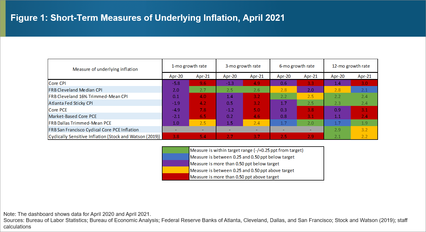
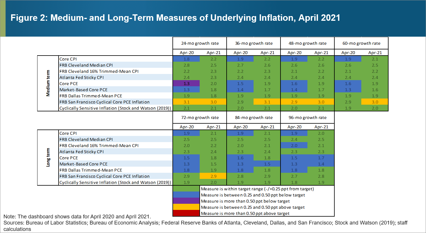
On the other hand, the longer-term measures of underlying inflation were suggesting that most measures were consistent with the FOMC's price-stability mandate. Figure 2 shows a snapshot of measures from 24 months to 96 months, and most of them were then at or just below target. Considering that these growth rates are depicted over medium- and longer-term intervals, emerging inflationary trends will start showing up only after a significant delay. This example highlights the need for monitoring a wide range of time horizons.
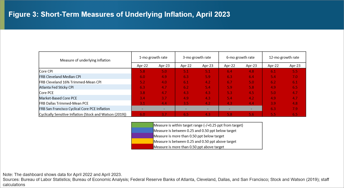
What does the dashboard say about the current state of these measures of underlying inflation? Figure 3 shows the UID for the near-term rates as of April 2023. Relative to 2021 and 2022, all measures of underlying inflation were still very elevated across the different frequencies, but we can see signs of easing inflation. Many of the near-term measures have been posting lower readings since a year ago, and almost all the 12-month rates have declined from their respective peaks, hinting at emerging downward inflationary trends. But of course, it's still too soon to be sure.
Although we think the extended dashboard approach described in this post represents an enhancement, we recognize that room for improvement always exists. We will continue to refine it, and we hope you find this approach as useful as we do. We look forward to hearing what you think about it.

By Emil Mihaylov, research analyst in the Atlanta Fed's Research Department